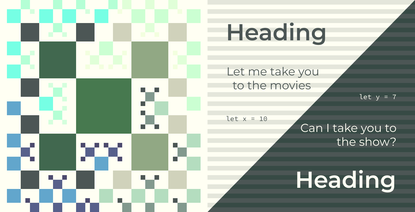
Over the holidays, I spent some time switching the site from Gatsby to Astro and add a dark mode toggle (see above). The switch was fairly straightforward and resulted in a codebase that will be easier to maintain. In the process of implementing the dark mode toggle, I found inconsistencies with my original SASS which made the conversion harder than it had to be. In response, I wanted to create something that was easier to extend while also looking less thrown together. This post will cover the visual design choices for the site including an 8pt grid, color swatches, and site typography. I hesitate to call it a “design-system” but these are some baby steps in that direction.
Principles
I have used both mature and project-specific design systems in the past but had never been involved in the early stages. Before I started creating any visual designs, research was required to learn how a design-system comes together. Going into the research phase, I laid out a few key factors that were important to my site:
- Readability - The primary reason for the site is to publish content. Font choice, line height, and line length are important factors to ensure folks can focus on the content rather than getting lost in the layout.
- Pattern-based - I am not a visual designer by trade, if there are patterns or rules I can follow to make color or visual design decisions, I am game.
- Extendable - Over time, I will want to add new components and features. Whatever solution I choose should enable me to build the new stuff in a simplified way.
Research
With the principles in place, I started searching for blog posts or implementation guidance for large scale design systems. Many blogs cited Atlassian, Google Material, and IBM’s Carbon design system documentation. I found Atlassian and IBM’s documentation to be quite consumable and explained both the theory and practice of implementing a design system.
The more I read about design systems, the more I saw mentions of using an 8pt grid system which was a new concept to me. Both IBM and Atlassian utilize 8pt grids as cornerstones to their designs. In addition to reading their content, I found a series of Medium posts by Vitsky where they discuss the topic and provide examples in Figma. Both links are member-only Medium posts: Design System based on the 8pt Grid and The Comprehensive 8pt Grid Guide.
With a conceptual understanding of the 8pt grid system, I decided to tackle typography and colors first. Subsequent articles will be written about the larger layout grid system and how components fit into it.
Putting It Together
Typography
The existing site leverages Montserrat but the font sizing, line height, and weight lacked a coherent strategy beyond h1 being larger than h2 and so on. Following many of the principles of the 8pt grid, I adjusted font sizes and line heights of each major element. To do so, I leveraged Montserrat in various weights and sizes.
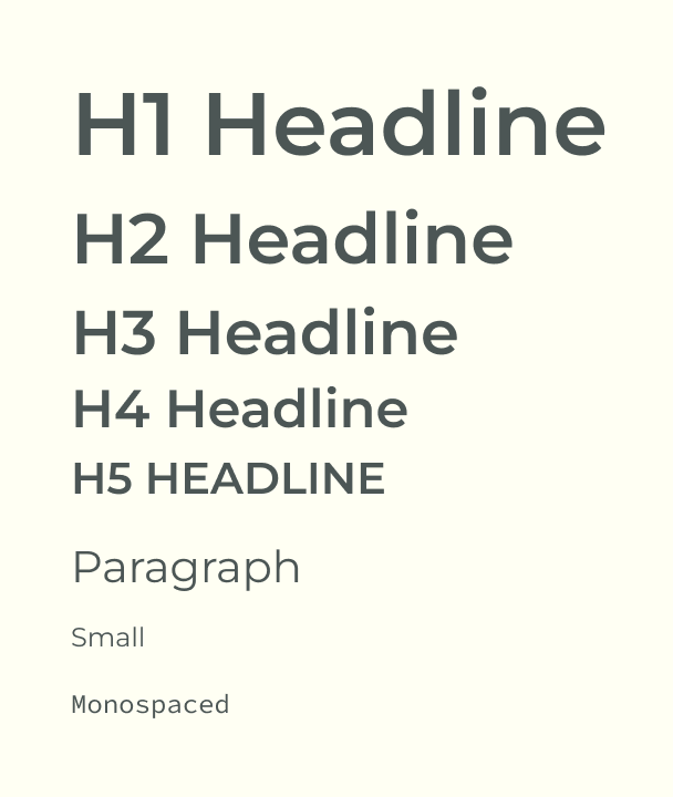
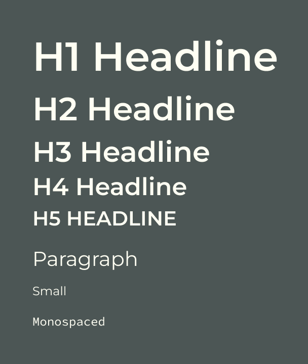
| Element/ Purpose | Font | Variable | Font Size (px) | Line Height (px) |
|---|---|---|---|---|
| h1 | Montserrat | SemiBold 600 | 40 | 48 |
| h2 | Montserrat | SemiBold 600 | 32 | 40 |
| h3 | Montserrat | SemiBold 600 | 28 | 28 |
| h4 | Montserrat | SemiBold 600 | 24 | 24 |
| h5 | Montserrat | SemiBold 600 | 20 | 24 |
| p prose | Montserrat | Regular 400 | 20 | 24 |
| prose small | Montserrat | Regular 400 | 12 | 24 |
| pre code | Source Code Pro | Regular 400 | 12 | 20 |
Colors
I liked many of the colors used on the current site and wanted to use those as starting points. Atlassian uses 10 or more swatches per palette which conveniently enables symmetrical colors when switching between light and dark modes. Per their example, a 10 swatch palette creates natural color pairs which offer light/dark mode equivalents. To start, I picked three colors which produced 30 total swatches.
Starting Colors
#74906c
#e6ffdb
#7CD4EB
Swatches
Neutral
#4e5655
#6a7773
#86988f
#a1baaa
#bcdcc1
#d6ffd6
#e6ffdb
#f5ffe2
#ffffea
#fffff4
Green
#2e3836
#384742
#41574b
#4a6751
#537853
#74906c
#95a787
#b4bda2
#d0d2bd
#e7e5da
Aqua
#4c4a6a
#596088
#667ea7
#72a4c8
#7cd4eb
#8af5f3
#9bfce5
#afffdb
#c5ffd8
#ddffe0
What’s Next
As it stands, the switch to color swatches and typography settings are incomplete and the SASS files are a mix between the old and new. A subsequent update using design tokens should make the switch complete. In subsequent updates, I hope to address the following:
- Design tokens
- Content grid
- Accessibility
- Theming
- Components (GitHub/Gist embed, inline code, block quotes, tables)
- Elevation/ shadows
- Animations